Informational
Understanding Color Theory in Design
Color theory can seem daunting for those who aren’t used to spotting and using it regularly. In my experience, some of the smartest scientists and programmers I’ve met have had difficulties understanding the theory and use behind color psychology. This is why I will attempt to summarize the theory behind using color in design, while also suggesting some first steps for novices.
Color Associations & Psychology

The first step in using color theory is knowing which colors trigger which psychological responses. It is important to note that not every use of a certain color will trigger the response it is usually associated with. You have to consider other psychological effects like priming or grouping, or in other words, you have to consider the color’s use within a greater context. Cultural references are also important to consider when using color. Green can mean money in America, but use that association in other countries and it may be less successful. Below is a list of some basic colors and their associations:
● Blue: Celestial, Professional, Mystique, Safety, Reliability (dark blue), Lightness, Openness (light blue), Sadness (dark blue)
● Red: Aggression in context, Power, Importance, Youth, Danger, Assertiveness, Love, Passion
● Yellow: Happiness, Vigor, Summertime, Youth, Enthusiasm, Wisdom (darker shades), Caution and Safety (with black)
● Green: Growth, Organic, Stability, Finance, Simplicity, Health, Nature, Balance, Modesty
● Purple: Luxury, Mystery, Indulgence, Intimate, Romantic, Delicate
● Orange: Uniqueness, Friendliness, Importance (with less aggression than red), Safety, Autumn, Warmth
● Black: Strength, Death, Luxury, Power, Sophistication, Morality, Edge, Definite, Assured
● White: Innocence, Simplicity, Virtue, Cleanliness, Science, Spirituality, Sterility
● Grey: Seriousness, Neutrality, Modernity, Melancholy, Sleek, New, Technology, Organization
● Beige & Off Whites: Antiquity, Elegance, Comfort, Adaptability, Softness, Classic, Ornate
Color Vocabulary
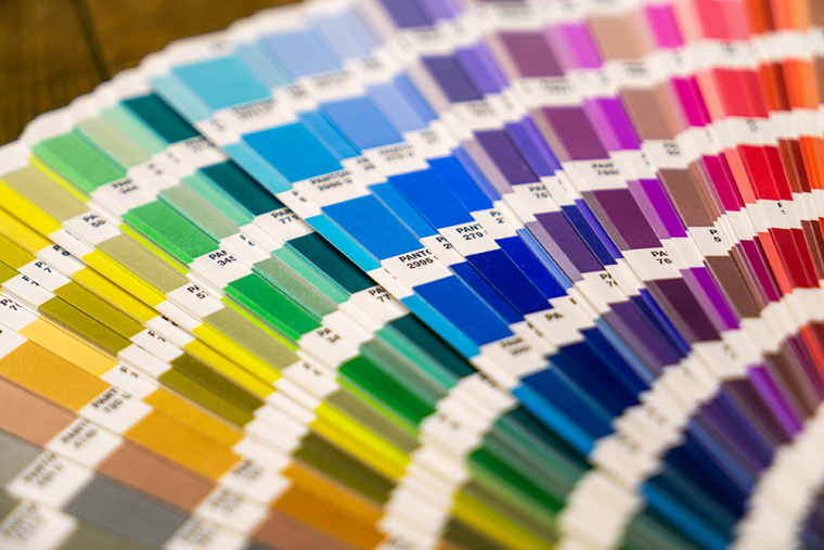
Now that you know some color associations, it is now time to discuss how to use a specific color. Not all Blues will evoke the same response, and using Beige in one area can actually direct attention away from that location. Knowing your color vocabulary can help you identify what shade of color you want to use, and it can help you craft a context where your design can be the most successful.
● Primary: The three basic colors that all other colors are made from. Traditionally, Red, Yellow, or Blue. More technically, Magenta, Cyan, and Yellow.
● Secondary: The colors that are made by mixing the primary colors. Purple, Green, Orange.
● Contrast: The value of colors being compared, used to differentiate values. Ex: Using black text over a white background, vs. black text over grey background.
● Saturation: A color’s intensity or vibrancy.
● Hue: The description of one color in terms of another color. Ex: Yellow-Orange vs. a Yellow-Green, yellow is described as having multiple hues.
● Lightness: Different from Saturation, a color’s relationship with pure white. Also known as brightness.
● Cold vs. Hot: A way to differentiate colors and undertones. Red, Yellow, and Orange are considered warm, Blue, Purple, and Green are considered colder. You can have a warmer blue and a colder yellow depending on the hue.
● Tint/Shade: Tint is created by adding or subtracting white levels. Shades are created by adding or subtracting black levels.
● RGB and Hex: Definitive color systems. RGB or Red Green Blue values (ex: RGB(59, 89, 145) makes Facebook blue. Hex converts every color to a hexadecimal, base 16 (ex: #3b599b makes Facebook blue).

Using Color Schemes
Now that you have a better understanding of how colors are used and described as a theory, you can turn your focus to how they are used in practice. Color schemes are palettes or groups of colors that are used in the context of one another. I would highly recommend familiarizing yourself with the color wheel before attempting any scheme, many of them are based on the color wheel and require an understanding of why colors are where they are. Four main themes are commonly used.
● Monochrome: One color presented in various tints or shades.
● Analogous: Using colors that sit near each other on a traditional color wheel.
● Complementary: Two or more colors that are on opposite ends of the color wheel.
● Triadic: Three colors equally dispersed across the color wheel, creates a visual triangle when connected on the wheel.

First Steps
Color theory can seem complicated, but it’s all about identifying instinctive reactions to colors and organizing them in a way that serves your ultimate goal. You can’t remain completely formulaic when using color theory in design, as various topics and cultures represent different associations for the same colors. Red can mean good luck in one culture, and can mean aggression in another. So, know your audience, embrace quirks, and be comfortable experimenting. I would recommend taking a look at some of your favorite web designs or marketing campaigns. What makes them engaging to you? What elements of color theory are they complying with? Where do they diverge? Your favorite campaigns may be simpler than you think!
Let’s start something great together!
Commercial Website
Personal Website
Android Applications
iOS Applications
Desktop Applications
Others
By submitting this form I accept the Privacy Policy of this site.


